Turning a fixed dashboard into a workspace
Sole designer on Dstny's telecom products. I replaced ConnectMe's fixed, ignored dashboard with a workspace users assemble themselves.
- B2C
- Communications
- Dstny
- Role
- Lead Product Designer
- Period
- Nov 2022 – present
- Team
- Sole designer, working with 2 PMs and 4 engineers across Dstny's telecom products
- Status
- in progress
- Read
- 4 min
Dstny sells communications software to telecom service providers. ConnectMe is the portal those providers use to run fixed and mobile calling for their own business customers, covering routing, presence and provisioning in one place. Named customers include 8x8 and Telia Sweden. There are three designers in the company, one per product, so I am the only designer on the products I work on.
ConnectMe's dashboard was a fixed set of widgets, the same for every service provider in the same arrangement. Users skipped past it. I replaced it with a workspace they build and customise themselves.
Every screen on this page is redacted at the company's request. Customer names, data and identifying detail are blurred or replaced. No unredacted product UI appears here.
The problemLink to this section: The problem
I joined the ConnectMe team at the right time, as they were just starting to review the recently launched Dashboard. One thing was immediately obvious, and it had to change.
Every service provider got the same widget types, in the same arrangement, whether or not any of it was relevant to the user looking at it.
When we asked service providers about it, the answer was not that the dashboard was wrong in some detail. It was that their users ignored it. People went straight past it to the pages they actually needed.
The reason why is that users under a service provider (and their customers) have different roles with different needs. An agent answering phones needs queues and a contact list. A salesperson needs a different set entirely.
ConstraintsLink to this section: Constraints
There is no analytics platform on ConnectMe, so there was no data on how end users used the dashboard or where they got stuck. Every argument made had to be made on reasoning rather than on measurement.
It also meant the feedback did not come directly to us, but instead came from service providers relaying what their customers had told them.
Time was tight throughout. The research, the design work and the prototype all had to fit inside a short window, which set the ceiling on how much of any of them I could do.
How I workedLink to this section: How I worked
- 01
Interviewed the service providers
With no analytics to read, the only route was qualitative data. That meant talking to service providers about how their users were using the dashboard, which is where the answer came from: they were not using it.
- 02
Put a plan together and took it back to them
The problem was flexibility. Users needed a workspace that matched their role rather than a single arrangement built for nobody in particular. I put that plan together and presented it back to the service providers before committing to it.
- 03
Designed it, then prototyped it with AI
I designed the workspace in Figma and prototyped it using AI. This was the first AI prototyping project at Dstny and I took it on, because showing a service provider a working prototype gets a real reaction, and showing them a flat screen gets a polite one.
The workspaceLink to this section: The workspace
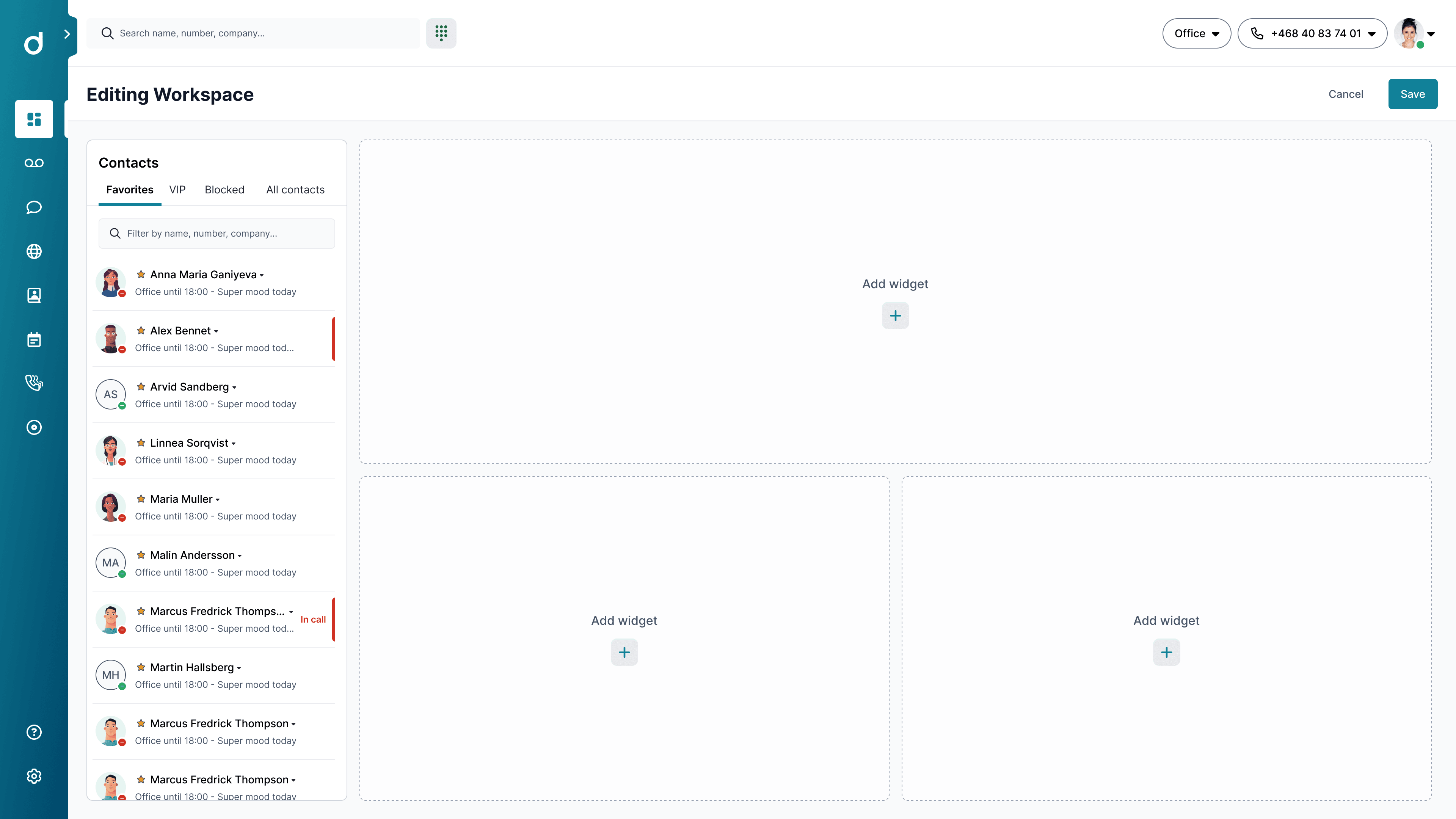
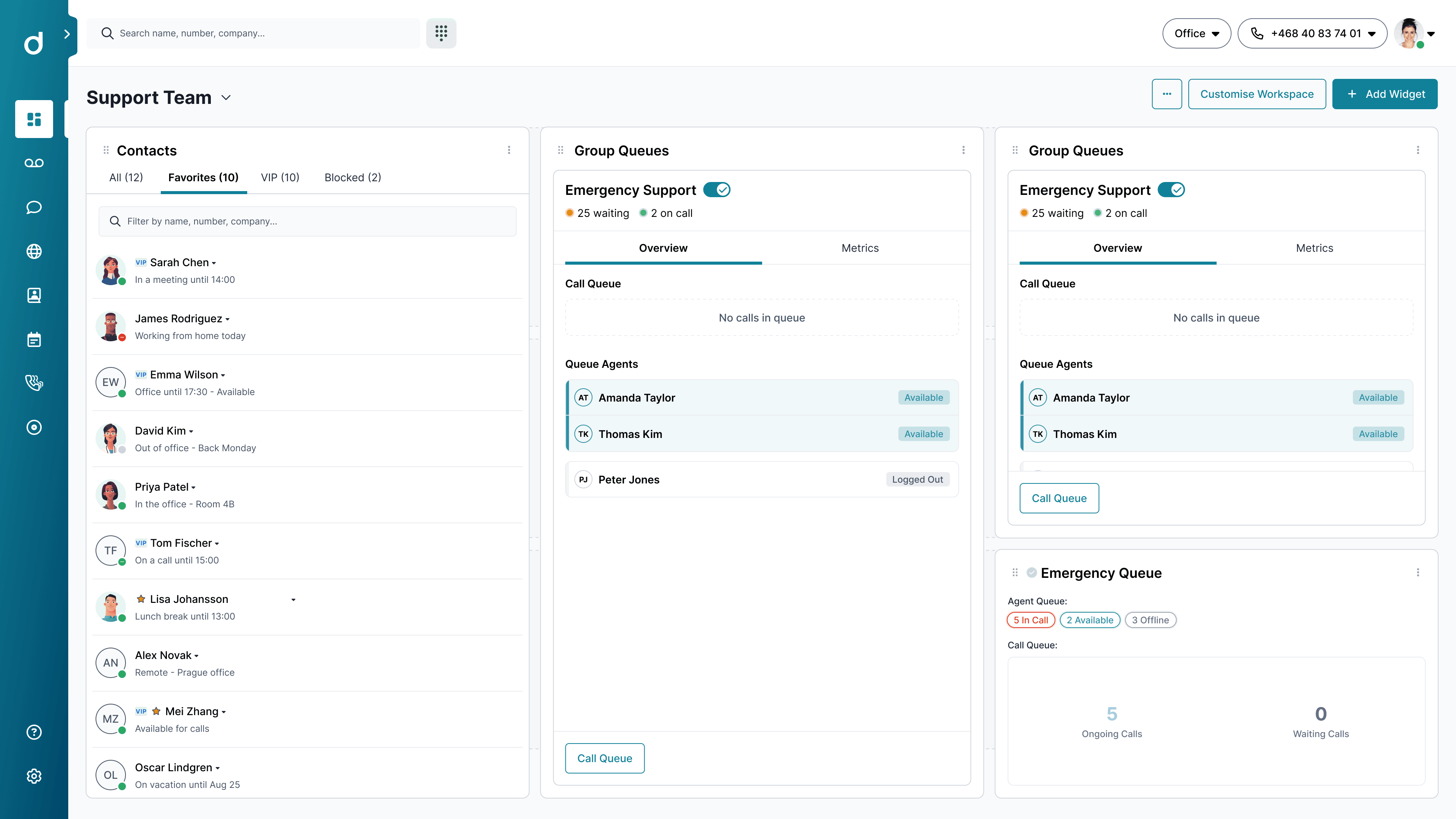
The user picks the widgets they want and arranges them. They can drag, resize and delete. The point is a single-glance overview of the things that particular person needs to watch, rather than the things everyone was given.
Call queues are the clearest case. A supervisor does not just want to see the queue, they want to act on it, so the queue is managed from inside the widget itself.
The part that mattered beyond this one screen was defining what a widget is: a pattern with rules, not a set of one-off panels. That is what makes partner widgets possible, where a service provider pulls data from outside ConnectMe into the same workspace. The goal; turning the dashboard from a hardly used screen, to a workspace the user would spend most time on.
What happenedLink to this section: What happened
The workspace is in engineering now. It has not been released.
Service providers who have seen it demoed responded very positively, and the prototype is a large part of why. It let them use the thing rather than picture it, which is a different conversation to the one a flat screen gets you.
There is no adoption figure to set beside that. Dstny has no analytics platform on any of its products. The other designers and I have pushed for one and it has not happened yet, so the demos are the evidence I have.
What I would do differentlyLink to this section: What I would do differently
I would push harder to reach the people actually using the dashboard. Everything I had came through service providers relaying what their users had told them. That was enough to establish that the dashboard was being ignored. It was not enough to see what any one role needed in its place, which is the question the whole design rests on.
Access to those users was never mine to grant. They are the service providers' customers rather than Dstny's, and there are reasons a provider does not hand their customers over. But asking for it was mine, and I did not ask often enough or make a strong enough case for it.